Posted by Anita on June 5th, 2008 — in audio features, contextual features, milestones, videos
Yesterday I set up the MusicBox to animate transitions as you enable or disable features. I took a short video of this: it starts with no features enabled, and I go through each feature (or set of features; they are enabled in blocks together, like all allmusic.com tags at once), adding it, and you can see the shape of the musical space change as those features’ influence are added and subtracted.
The program is recalculating the space after every change, by performing a new principal components analysis, and then displaying all the tracks in their new locations.
Click image to view QuickTime movie (14.2 MB).
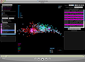
The animation isn’t perfect, specifically because the scale can change dramatically when feature sets are changed, and I didn’t interpolate that properly (it’s too complicated given the way I’ve written my code… blech, lesson learned). But it still gives a good sense of how each song is moving throughout the changing space.
No Comments »
Posted by Anita on April 20th, 2008 — in audio features, contextual features, screenshots
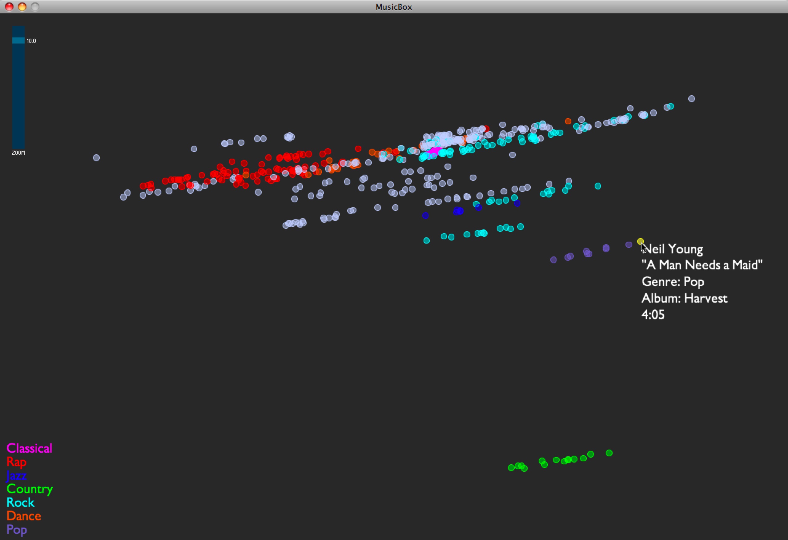
I implemented the first set of contextual data for my test set of music. I’m grabbing moods off of allmusic.com. These are descriptors like “spooky”, “lively”, or “epic”, which are usually listed per album. I’m incorporating these features into the PCA by treating each descriptor as a separate feature, giving each song with the given descriptor a “1”, and all others a “0”. These contextual data are being added into the model that already has audio-based data.
As expected, this stratifies the whole data set, and is an interesting way of separating out the albums… those albums with the same sets of mood tags appear in a stripe across the space, and their position in the stripe comes from the audio features. If I had to guess what the audio feature separation means here, I’d say it’s distributing music on a spectrum of edgier, more bursty sounds (on the left in this visual representation) to smoother, softer sounds (on the right). I am guessing this purely from inspection.
Here are some examples:
- I see a stripe of this album: Backstreet Boys — “Black & Blue”. It moves from “Shining Star” (click to listen; you need Windows Media Player) on the edgy side, to “How Did I Fall In Love With You“ (click to listen IF YOU DARE; you need Windows Media Player) on the smooth side.
- I see a stripe of this album: The Beatles — “Sgt. Pepper’s Lonely Hearts Club Band”. It moves from “Getting Better” on the edgy side, to “Lovely Rita” in the middle, to “A Day In the Life” on the smooth side.
- I see a stripe of this album: 10,000 Maniacs — “Our Time in Eden”. It moves from “Candy Everyone Wants“ on the edgy side, to “How You’ve Grown“ on the smooth side.
Also, Busta Rhymes’ smoothest piece in the test set, “Hot Fudge”, is way less smooth than the Beatles’ edgiest piece.
No Comments »