Posted by Anita on September 15th, 2008 — in documents, milestones, screenshots
I submitted my written thesis in early August 2008. Rather than continue to hold off on posting it for IP reasons, I’m going to opt for the “open is better” attitude and just post it. I hope that this will encourage people to chat with me about where this research stands, where it’s going, and how they can get involved.
If this is your first visit to this site, I’ll briefly catch you up: This is a blog for my Masters thesis at the MIT Media Lab, on a music browser called MusicBox. In this blog, you can find screenshots and videos of the project, which show the interactive maps that MusicBox creates.
I intend to continue developing MusicBox in the coming year, but will likely not update this blog with the developments, since the project as a thesis is complete. Once I decide where I will post updates, I will add a link here. (The new place will have a more complete set of screenshots and videos.)
If you would like to read my written thesis (10.2 MB, 124 pages), you can download the PDF. Feel free to send me feedback, either by posting a comment here or by emailing me.
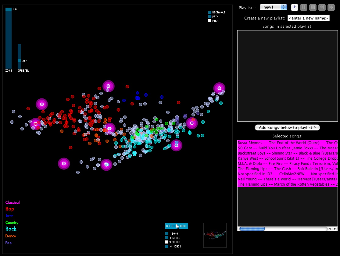
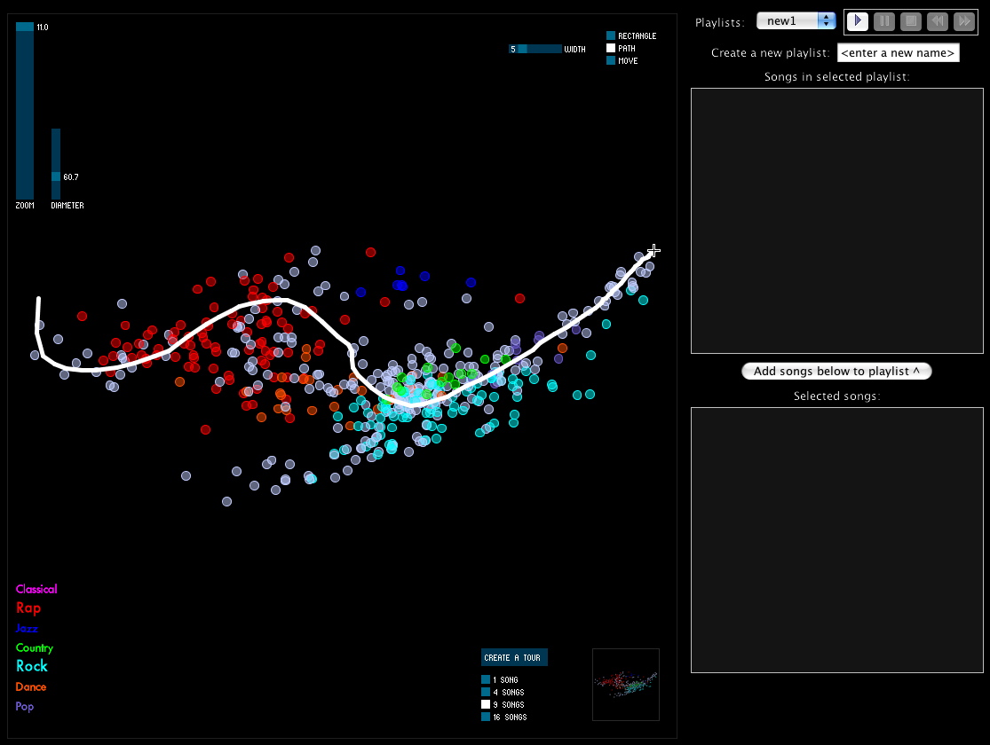
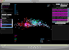
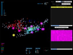
Here is what MusicBox looked like at the time my thesis was submitted:

A quick guide to the parts of this interface is displayed here:
(See my written thesis for much more detail.)

3 Comments »
Posted by Anita on June 5th, 2008 — in audio features, contextual features, milestones, videos
Yesterday I set up the MusicBox to animate transitions as you enable or disable features. I took a short video of this: it starts with no features enabled, and I go through each feature (or set of features; they are enabled in blocks together, like all allmusic.com tags at once), adding it, and you can see the shape of the musical space change as those features’ influence are added and subtracted.
The program is recalculating the space after every change, by performing a new principal components analysis, and then displaying all the tracks in their new locations.
Click image to view QuickTime movie (14.2 MB).
The animation isn’t perfect, specifically because the scale can change dramatically when feature sets are changed, and I didn’t interpolate that properly (it’s too complicated given the way I’ve written my code… blech, lesson learned). But it still gives a good sense of how each song is moving throughout the changing space.
No Comments »
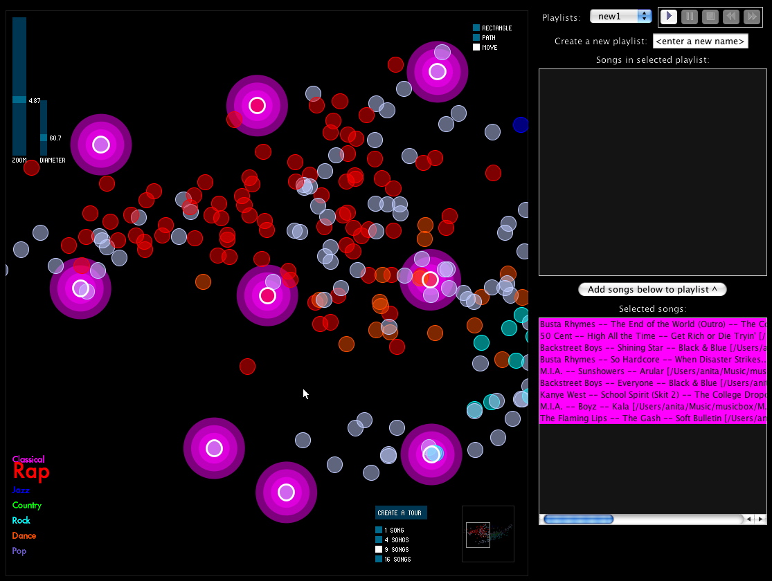
Posted by Anita on June 4th, 2008 — in milestones, screenshots
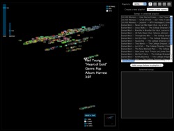
I’m trying to wrap up the main coding tasks this week. Here’s what the interface to the MusicBox software looks like today:
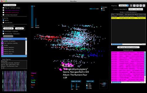
I’ve added a few new features, and done a fair amount of debugging, over the past 1-2 weeks. Here are screenshots of some of the new features…
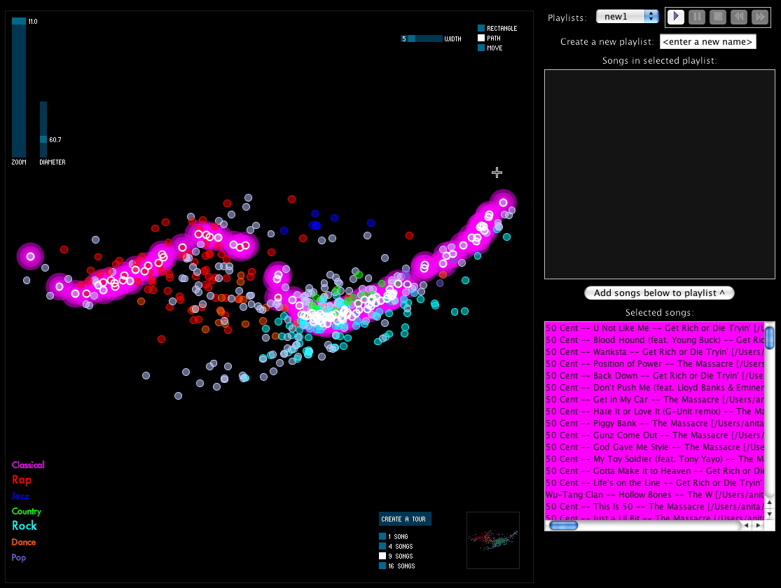
Create a tour
The “Create a tour” feature helps when you want to get a general idea of what music is sitting in front of you. You select a tour size, and the program selects that many songs evenly-dispersed through the space. With one click, you have a new playlist made up of a sampling of songs that represents the variety of music in the library.
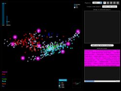
In the screenshots, the glowing pink songs are the songs in the tour, and are automatically added to your working list of songs on the right. You can create a tour of whatever portion of the library you are currently viewing.
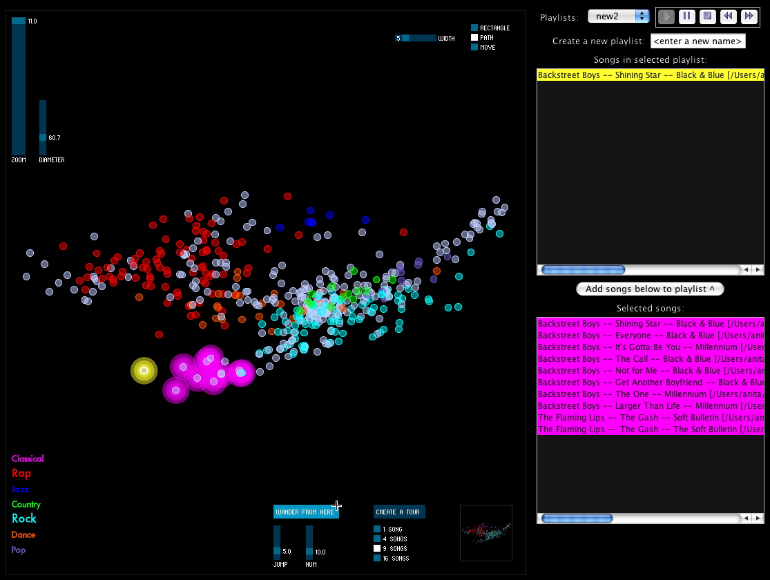
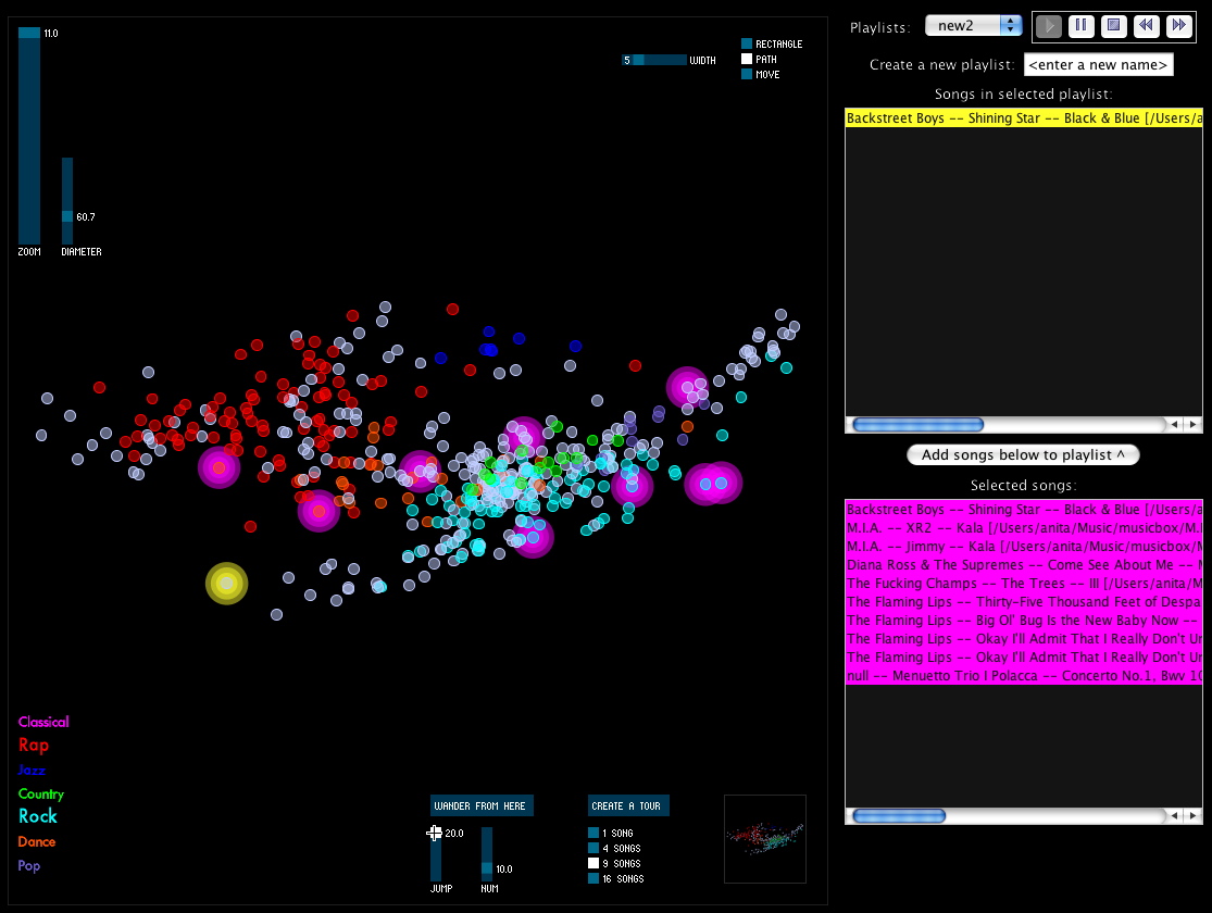
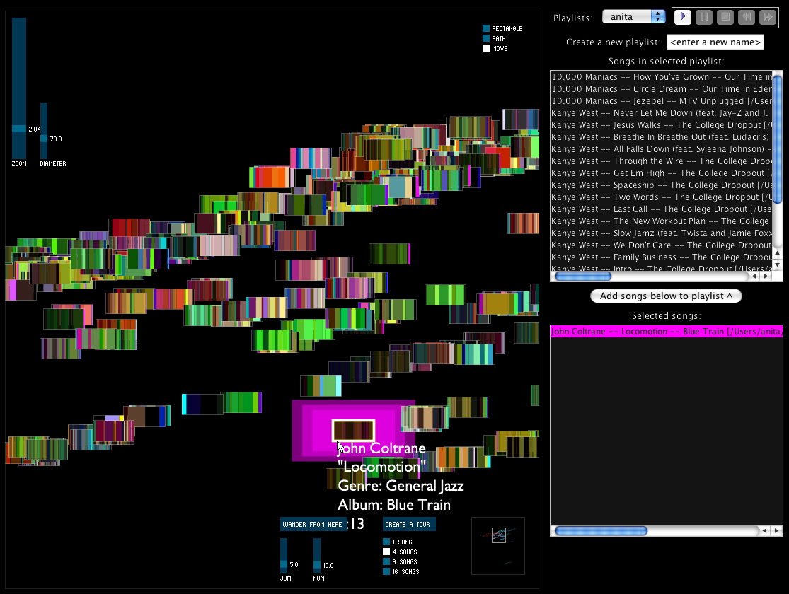
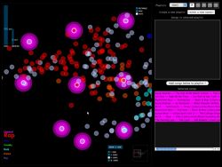
Wander from here
The “Wander from here” feature is a smart shuffle. If you like the song you are currently listening to, you can click on “Wander from here”, and the program will do a random walk through the space, starting with the current track. To choose each track, it will only venture a particular distance (that you set) from the previous track. This way, you can avoid those abrupt (and sometimes unpleasant) acoustic shifts you might experience in an iTunes shuffle.

In the screenshots, the yellow song is the current song, and the pink songs are those that have been selected for the “Wander from here” feature. The first screenshot shows a random walk with a small jump size (more smooth acoustic changes from track to track), and the next shows one with a large jump size (more dramatic changes).
Playlists as paths


Say you want to start with your hard-hitting rap and hip-hop, and move step by step to your classical music. The playlist path function lets you do this by drawing a path through the space; it selects the songs along that path.
The first screenshot was taken while the user was drawing the path, and the next screenshot shows the resulting selection of songs along that path.
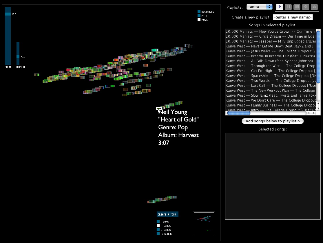
Soundsieve view
Instead of viewing each song circle colored according to the genre in the ID3 tag, you can view each song as a mini soundsieve-style image. These images summarize some acoustic characteristics of each song, like a visual fingerprint. This view is inspired by my previous project on visualizing music, soundsieve.

3 Comments »
Posted by Anita on May 20th, 2008 — in milestones, videos
I showed Paul this video (13 MB) last week, but really anyone should be able to see it. The interface is changing every day, so it doesn’t look the same as this now, but this video shows:
- general interaction: rollover play, panning, zooming, etc.
- turning features on/off and seeing effect on the space
- playlist creation: selection with rectangle or path (not quite finished when the video was made)
No Comments »
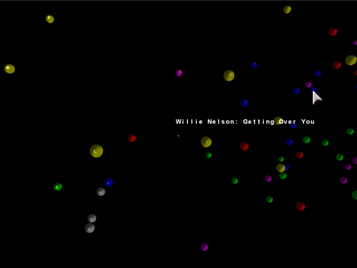
Posted by Anita on April 13th, 2008 — in milestones, screenshots
Now posting the equivalent of the last post‘s video, except in 2D, built with Processing. Just click the image below to load the 1.5 MB QuickTime video (larger version here — 12 MB). This is the version I demo-ed for sponsors April 1st and 2nd.
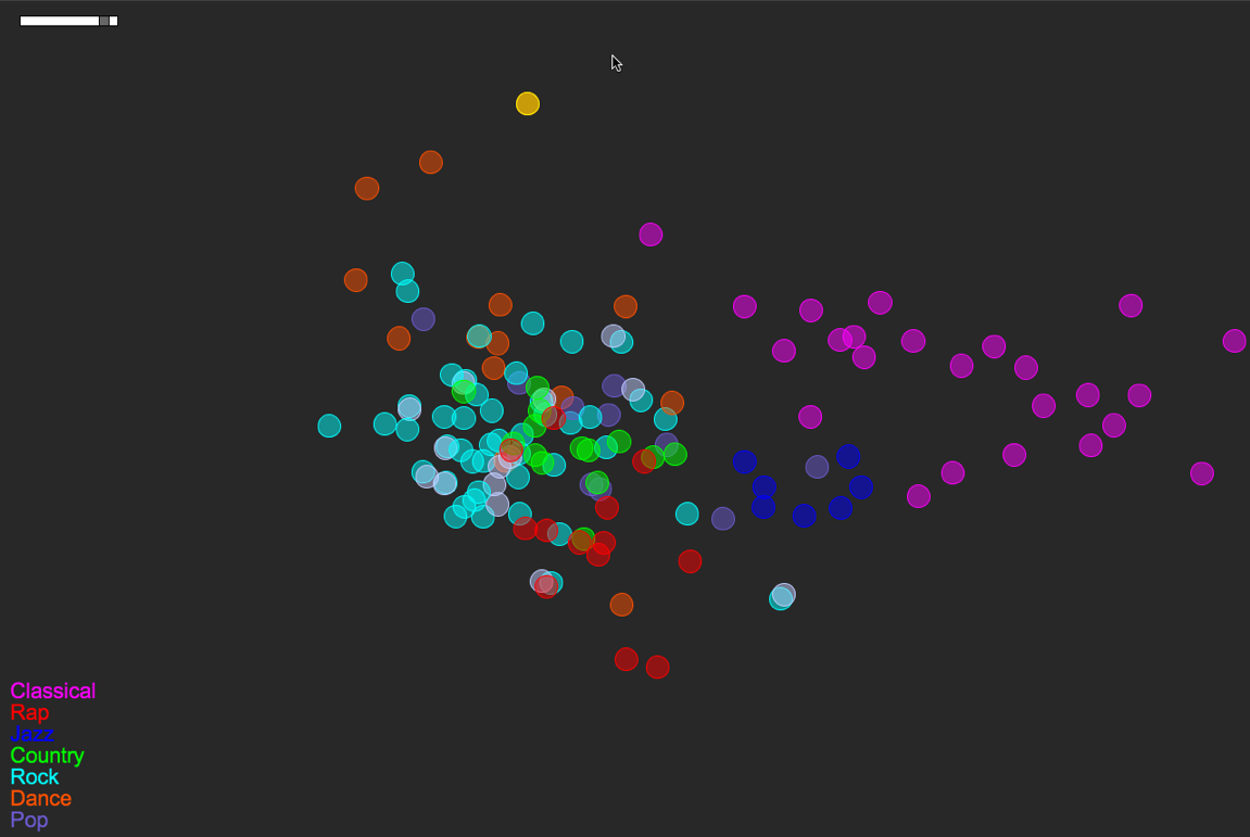
Songs/circles are still located based on a PCA of timbre, tempo, duration, number of distinct sections, and time signature stability. The circles’ colors are mapped straight from genre tag (see the legend at bottom-left).
Here’s a more detailed look at the layout of this small music library:
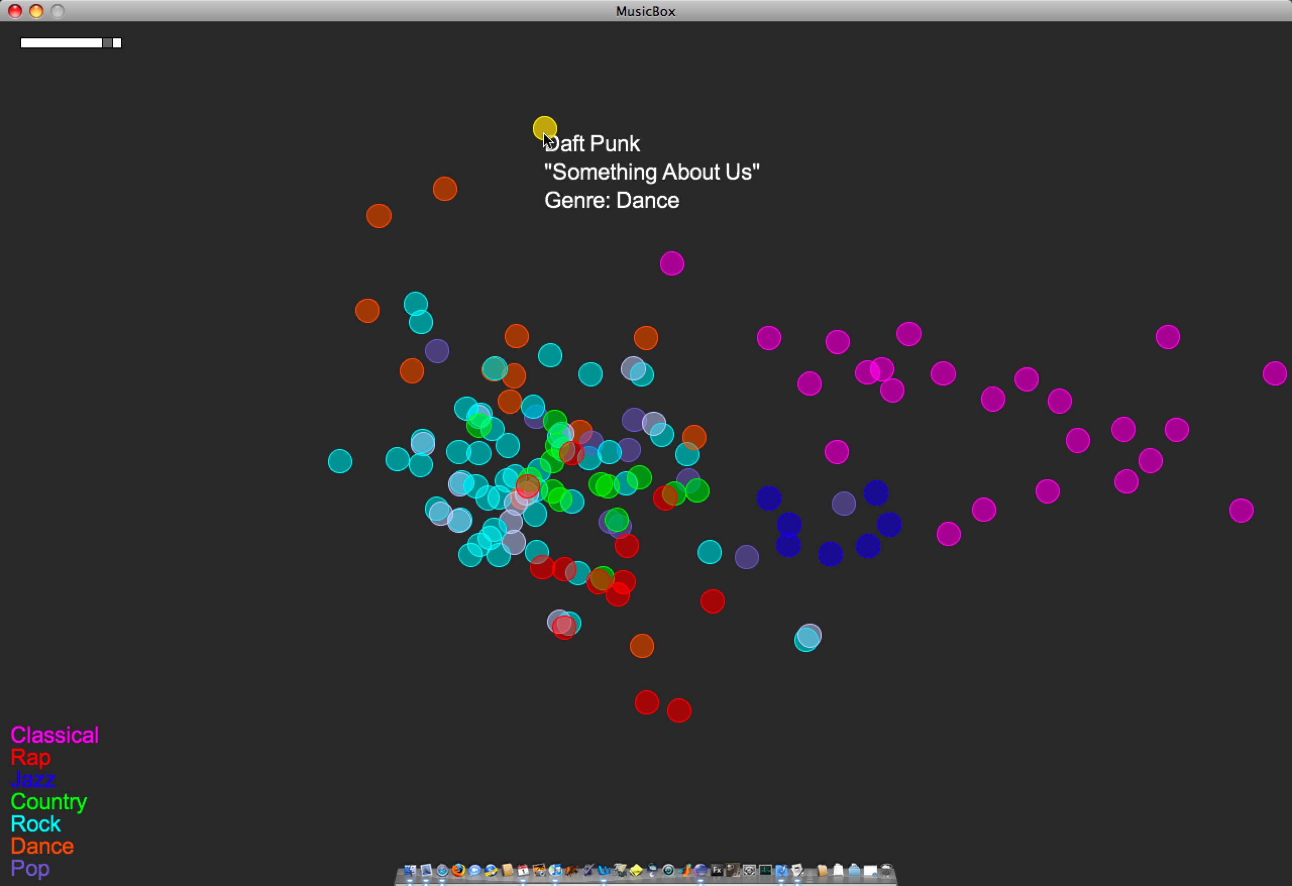
A few things to note:
- Some of the genre colorings are fairly well separated/clustered based on the small set of audio features I’m using. Note how classical music sits almost on its own. Jazz sits neatly nearby, between Classical and everything else. Rock is a nice mess that overlaps with Pop, Country, Rap, and Dance. These are relationships that make sense if you think about how loose or tight each genre label is.
- In a few instances, there are pairs of songs that are actually the same track at different bit rates (I had duplicates-with-different-bit-rates in the test library). One example of this is the light-blue-and-white pair just south of Jazz. This is The Flaming Lips’ “The Observer”, at bit rates 256 and 192. (One of those has a bad genre tag as well — That’s why it’s white.) Looking at The Flaming Lips’ “Zaireeka” album (not pictured) was also very cool, since you can see how the complementary stereo tracks are either very similar or very different.
- I listened to the leftmost Country song; it is Willie Nelson’s “Still is still moving to me”. According to this representation of the music library, this is the “country song most like rock”. You can certainly argue for or against that, but it’s still interesting to be able to start making characterizations like this.
- This is a small library (~150 songs). As it gets bigger, and as the feature set grows (i.e. when I implement new features), hopefully these patterns will just become more meaningful… We’ll see.
3 Comments »
Posted by Anita on March 27th, 2008 — in milestones, screenshots
Just posting a short video of the unfinished 3D browser. I’ve decided to focus on a 2D interface built with Processing, but wanted to show anyone who’s interested how far I went with the 3D version. Just click the image to load the 10 MB QuickTime video.
Songs/spheres are located based on a PCA of timbre, tempo, duration, number of distinct sections, and time signature stability. The spheres’ colors are mapped straight from genre tag (e.g. yellow is “Classical”).
2 Comments »
Posted by Anita on March 5th, 2008 — in definitions, feedback, milestones, organization
I’m at a big decision point in my thesis. I have a very primitive music browser implemented in both 2D and 3D. I want to choose the number of dimensions (2 or 3) for my main project before I move too much farther in developing the interface. I just don’t have time to develop them both.
My biggest concern: I had been pushing for a 3D interface throughout the proposal process, but I’m worried that continuing with it will force me in my remaining time to focus much more on elements of 3D interfaces (e.g. how to orient the user, how to show the overall cloud shape despite obscuration) than on elements core to my own thesis motivations (e.g. how to organize music, how to find patterns in music listening).
I think a 2D interface is currently more easy to develop than a 3D interface, and that perhaps I should focus on only two dimensions and have a better chance of making an interface that demonstrates all the things I had hoped to show (outlined in my proposal).
In the end, my thesis is not about interfaces; it is about the organizational model itself. That organizational model is the use of audio and contextual data to organize a music collection in a fuzzy manner that I think is more appropriate for this type of data, in addition to providing others with a framework to add onto it, both in terms of input features and output interface. This approach is in opposition to what we see in most music browsers (well, and data browsers in general), which limit organization to non-configurable lists and, ultimately, text labels.
So, my thesis work becomes: (1) an implementation of this organizational model, (2) made publicly-available, along with (3) demonstration(s) of an interface built on top of the model. An analog to this manner of thinking is the Echo Nest’s recent announcement of their AudioAnalysis API. Last year, they made this tool (1) available to others (2) — it gave me numbers, and I built an interface on top of it (3). In this thesis, I am the one providing the numbers, and letting others build interfaces on top.
Even though the main contribution is the model, I will demonstrate one such interface with a 2D representation of a music collection that is user-configurable and dynamically updated through RSS feeds.
Here are the main questions:
- Am I losing something integral to the project if I move down from three dimensions to two?
- Is this line of thinking (that my contribution is more an organizational model than an interface) too dangerous?
- Am I contributing enough?
1 Comment »
Posted by Anita on February 24th, 2008 — in milestones, screenshots
Ok, this is pretty ugly… but I’m very excited to see it. It is the first test image coming out of the PCA engine I’ve built. It’s mapping test tracks based on timbre values, number of sections, duration, and time signature. JFreeChart was a great recommendation, thanks Paul :)
(The “null”s are Bach.)
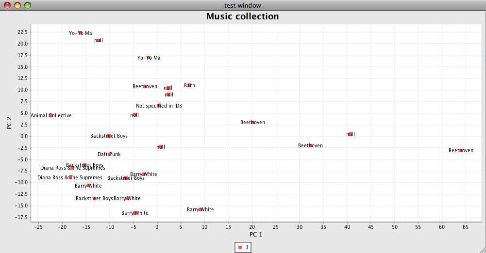
I’ll use this kind of interface as I clean up the code and test out new features. Then, on to 3-D!
No Comments »
Posted by Anita on February 22nd, 2008 — in milestones
I’ve got a working PCA engine, and a few simple features implemented. I also have acquired a large set of MP3s with accompanying Echo Nest data, to create test libraries. So now I have code that takes a small test library, computes/retrieves a handful of audio features for that library, and remaps the tracks onto a smaller-dimensional space.
Now I’m working on a way to show the PCA results visually, since it’s much harder to test without that. I’m also developing new Feature classes focusing on general timbral descriptions of a track.
No Comments »
Posted by Anita on December 2nd, 2007 — in milestones
I got this email on November 29:
Anita ~ MASCOM has reviewed the comments by your readers as well as the comments provided as a result of your presentation on Crit day — congratulations your proposal is considered approved.
1 Comment »