3D music browser
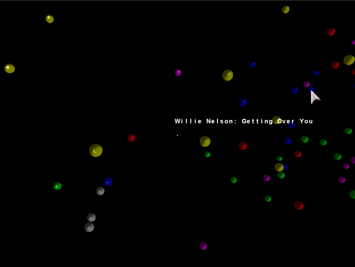
Just posting a short video of the unfinished 3D browser. I’ve decided to focus on a 2D interface built with Processing, but wanted to show anyone who’s interested how far I went with the 3D version. Just click the image to load the 10 MB QuickTime video.
Songs/spheres are located based on a PCA of timbre, tempo, duration, number of distinct sections, and time signature stability. The spheres’ colors are mapped straight from genre tag (e.g. yellow is “Classical”).

Comment by Scott
Posted on March 29, 2008 at 12:46 am
As cool as the 3D interface is, I think you made the right choice. Not only would it distract you as you try to build it, I think it could distract the users as well. As I watched the dots rotate, I realized that it could give you the impression that unrelated items are related. Imagine your data organized across 3 axes, ranging from 0 to 1. There are various clumps of songs, including one near (0,0,0) and one near (1,1,1) – as far apart as they can be. Rotate it so you’re looking along a line from the origin to (1,1,1). Now those unrelated clumps look like they’re neighbors. Yeah, the size & lighting could convey that they’re a ways apart, but it seems like it could mislead as much as it could enlighten.
Pingback by Anita Lillie’s Masters Thesis » Blog Archive » 2D music browser, v0.0.1
Posted on April 13, 2008 at 8:25 pm
[…] posting the equivalent of the last post’s video, except in 2D, built with Processing. Just click the image below to load the 1.5 MB […]