2D music browser, v0.0.1
Now posting the equivalent of the last post‘s video, except in 2D, built with Processing. Just click the image below to load the 1.5 MB QuickTime video (larger version here — 12 MB). This is the version I demo-ed for sponsors April 1st and 2nd.
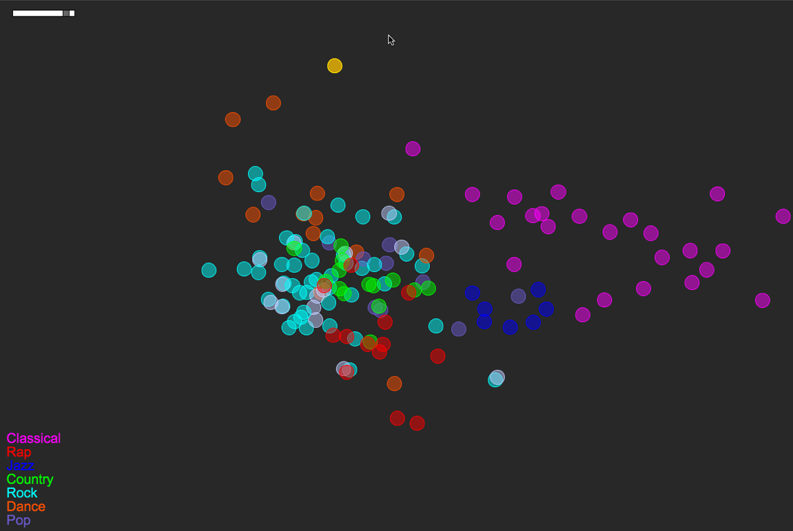
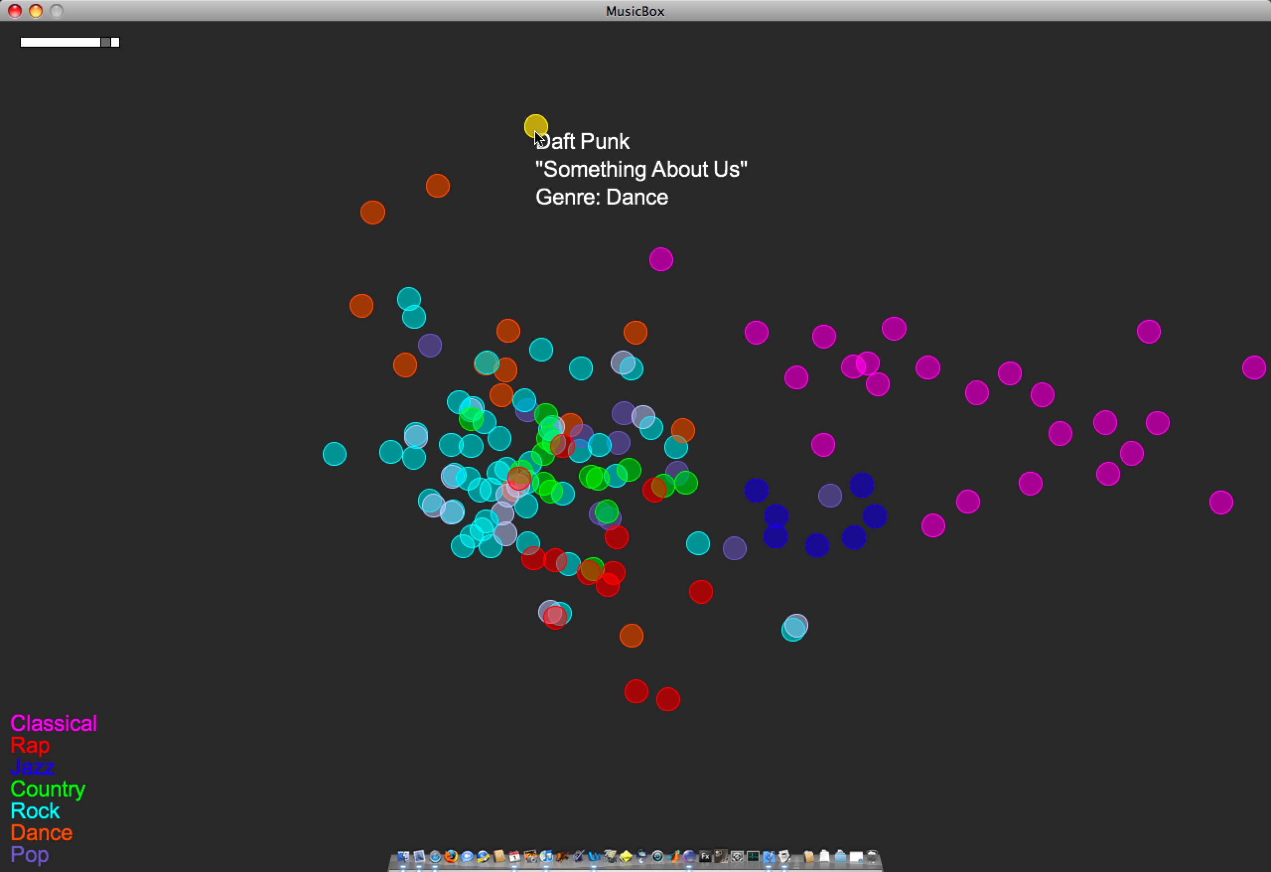
Songs/circles are still located based on a PCA of timbre, tempo, duration, number of distinct sections, and time signature stability. The circles’ colors are mapped straight from genre tag (see the legend at bottom-left).
Here’s a more detailed look at the layout of this small music library:
A few things to note:
- Some of the genre colorings are fairly well separated/clustered based on the small set of audio features I’m using. Note how classical music sits almost on its own. Jazz sits neatly nearby, between Classical and everything else. Rock is a nice mess that overlaps with Pop, Country, Rap, and Dance. These are relationships that make sense if you think about how loose or tight each genre label is.
- In a few instances, there are pairs of songs that are actually the same track at different bit rates (I had duplicates-with-different-bit-rates in the test library). One example of this is the light-blue-and-white pair just south of Jazz. This is The Flaming Lips’ “The Observer”, at bit rates 256 and 192. (One of those has a bad genre tag as well — That’s why it’s white.) Looking at The Flaming Lips’ “Zaireeka” album (not pictured) was also very cool, since you can see how the complementary stereo tracks are either very similar or very different.
- I listened to the leftmost Country song; it is Willie Nelson’s “Still is still moving to me”. According to this representation of the music library, this is the “country song most like rock”. You can certainly argue for or against that, but it’s still interesting to be able to start making characterizations like this.
- This is a small library (~150 songs). As it gets bigger, and as the feature set grows (i.e. when I implement new features), hopefully these patterns will just become more meaningful… We’ll see.


Comment by Paul
Posted on April 14, 2008 at 2:06 pm
To deal with the density issue take a look at the liquid browsing stuff:
http://www.liquidbrowsing.com/
and some of the work that Justin Donaldson has done.
Comment by Paul
Posted on April 14, 2008 at 8:02 pm
BTW, what tool are you using to capture videos of your interfaces?
Comment by Anita
Posted on April 14, 2008 at 8:07 pm
I’m using Snapz Pro X 2 w/ movie capture.