Posted by Anita on March 27th, 2008 — in milestones, screenshots
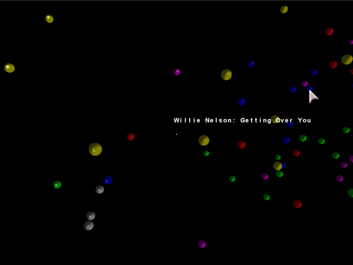
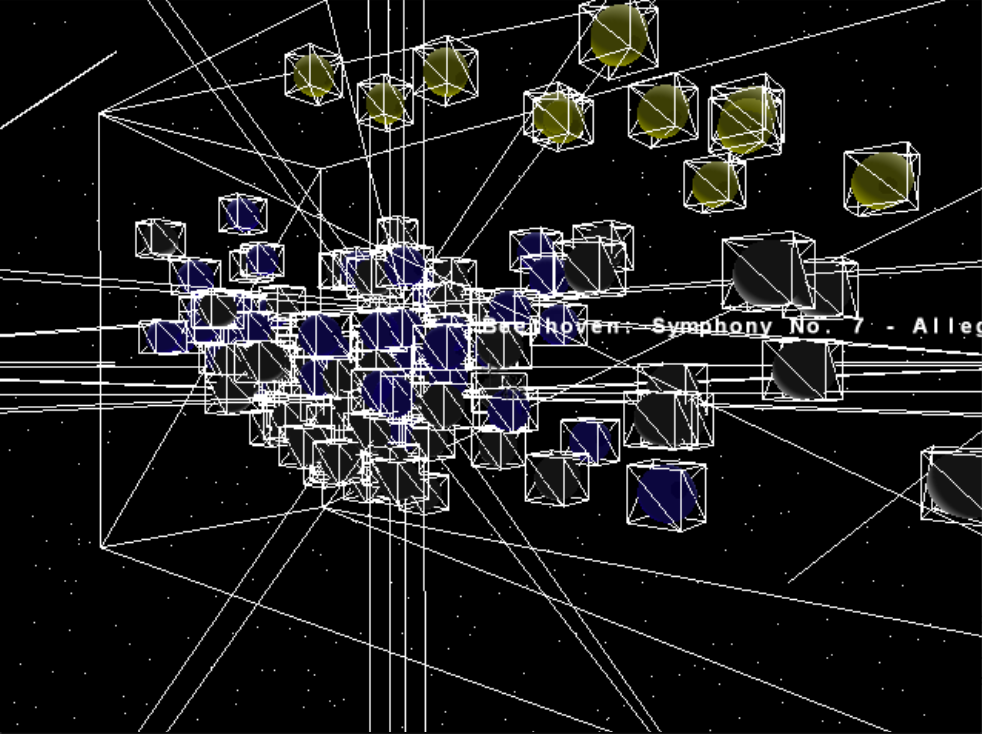
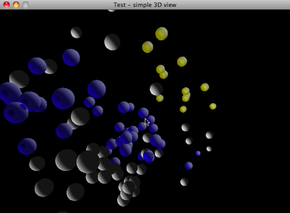
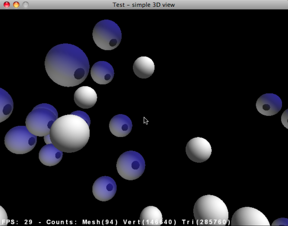
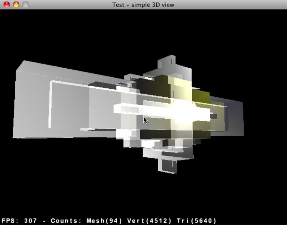
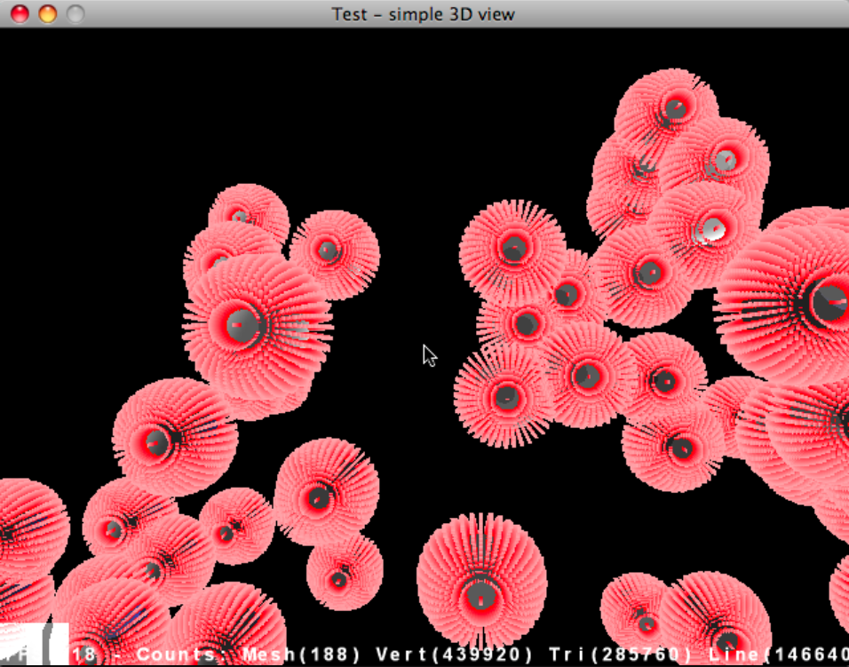
Just posting a short video of the unfinished 3D browser. I’ve decided to focus on a 2D interface built with Processing, but wanted to show anyone who’s interested how far I went with the 3D version. Just click the image to load the 10 MB QuickTime video.
Songs/spheres are located based on a PCA of timbre, tempo, duration, number of distinct sections, and time signature stability. The spheres’ colors are mapped straight from genre tag (e.g. yellow is “Classical”).

2 Comments »
Posted by Anita on March 15th, 2008 — in feedback, papers, background
Does anyone know of some projects/papers on spatially-based organization of digital music collections? I’m trying to gather information for writing my thesis’s “Background” section.
Here’s what I have so far:
I am going to implement a mode in my interface that is completely free-form, allowing the user to assign tracks to locations however they want. Does anyone know of projects that allow for this kind of music library organization?
13 Comments »
Posted by Anita on March 13th, 2008 — in mistakes
Just a couple more silly mistakes in the 3D world. A screenshot / demo-video of the current state of the intended 3D model is coming soon, after this silly stuff…


1 Comment »
Posted by Anita on March 13th, 2008 — in Uncategorized
I’m going to take an extra month or two to finish my thesis. I’m now aiming to turn in the final draft, signed by my readers, around late June or early July.
I decided to take more time because I realized that the pressure of my current schedule was leading me to make poor design decisions, and to lose focus of the big picture of my thesis work. Hopefully I can do a better job than that.
No Comments »
Posted by Anita on March 6th, 2008 — in definitions, feedback
The responses I got to my previous post about evaluation requirements for my thesis pretty much boils down to this: I need to clarify what I hope my contribution will be before I can decide how to appropriately test it.
To make my goals more clear, here are the kinds of questions I’m trying to ask with this new interface:
- Does this spatial interface give a better understanding of the overall scope of your music?
- Is the music->visual mapping intuitive?
- To introduce the notion of “really fuzzy searching”… Is a spatial representation more appropriate than text-based lists for music browsing?
- Does the interface help you see/examine your listening patterns?
- Does the interface help you see the relationship between multiple people’s music libraries?
- Can you more easily find music of a certain style/type, or for a particular activity, than you can with a more traditional music browser?
- Can looking at your music and someone else’s music at the same time in the space help you find recommendations for new music?
- Does this interface change what things are important when it comes to looking at your library? Do you find that you are looking for, or thinking about, different sorts of things than you would with a traditional music browser?
- Does the interface make you more aware of the context for your music-browsing decisions?
1 Comment »
Posted by Anita on March 5th, 2008 — in definitions, feedback, milestones, organization
I’m at a big decision point in my thesis. I have a very primitive music browser implemented in both 2D and 3D. I want to choose the number of dimensions (2 or 3) for my main project before I move too much farther in developing the interface. I just don’t have time to develop them both.
My biggest concern: I had been pushing for a 3D interface throughout the proposal process, but I’m worried that continuing with it will force me in my remaining time to focus much more on elements of 3D interfaces (e.g. how to orient the user, how to show the overall cloud shape despite obscuration) than on elements core to my own thesis motivations (e.g. how to organize music, how to find patterns in music listening).
I think a 2D interface is currently more easy to develop than a 3D interface, and that perhaps I should focus on only two dimensions and have a better chance of making an interface that demonstrates all the things I had hoped to show (outlined in my proposal).
In the end, my thesis is not about interfaces; it is about the organizational model itself. That organizational model is the use of audio and contextual data to organize a music collection in a fuzzy manner that I think is more appropriate for this type of data, in addition to providing others with a framework to add onto it, both in terms of input features and output interface. This approach is in opposition to what we see in most music browsers (well, and data browsers in general), which limit organization to non-configurable lists and, ultimately, text labels.
So, my thesis work becomes: (1) an implementation of this organizational model, (2) made publicly-available, along with (3) demonstration(s) of an interface built on top of the model. An analog to this manner of thinking is the Echo Nest’s recent announcement of their AudioAnalysis API. Last year, they made this tool (1) available to others (2) — it gave me numbers, and I built an interface on top of it (3). In this thesis, I am the one providing the numbers, and letting others build interfaces on top.
Even though the main contribution is the model, I will demonstrate one such interface with a 2D representation of a music collection that is user-configurable and dynamically updated through RSS feeds.
Here are the main questions:
- Am I losing something integral to the project if I move down from three dimensions to two?
- Is this line of thinking (that my contribution is more an organizational model than an interface) too dangerous?
- Am I contributing enough?
1 Comment »
Posted by Anita on March 4th, 2008 — in mistakes, screenshots
Some of these resulted directly from bugs/experimentation in the code.


No Comments »
Posted by Anita on March 4th, 2008 — in definitions, feedback
I asked Tod what he expects in terms of user evaluations for my thesis project. I’m sharing what he told me with all of my readers, here, so that they can get a better sense of what to expect (or not to expect). From this, I intend to provide a personal critical review, along with some anecdotal comments/criticisms from friends and colleagues, but not a scientific analysis or formal user study.
“For the system you are designing, I would put an emphasis on first and foremost building a really killer application based on your underlying research, grounding this in a discussion of important precedents and your reasons for doing this work, following the design process and how important decisions were made, capped with your own critical analysis of the system, including what works best, what remains most problematic, and what major challenges remain. If you wanted to do some limited user testing, that would be fine, but for this particular project I would be more interested in your ideas and your evaluation.”
John, Paul, and Henry: Please let me know if you have any concerns about my plans for the evaluation part of my thesis work.
2 Comments »
